Thursday, 25 April 2019

Final Evaluation

A Review

This unit has been very engaging when it comes to how it has quite a wide range of topics to do, all compressed into a single option. Choosing curves and circles was an interesting choice for me as it gave a modest amount of freedom on what I would be photographing. Through the first few shoots, I had some minor struggles. But as the project progressed I improved. With my best shoot being (in my opinion) shoot 1 however, that is because it was one of the final shoots to have been taken.

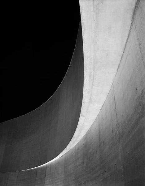
In the exam, I have faced a multitude of different tasks to complete within the given ten hours, which I believe passed off as being rather creditable. I began with Work Record Shoot 1. In this shoot and the other, I decided to go for a more abstract view on curves, which I feel worked quite well.


The first image pictures a sculpture of a butcher found in Harlow Town Centre. To create this photo I began with using a plethora of different techniques in camera RAW. After the pleasantries, I burned and dodged the shadows of the statue, creating a big contrast to the statue and the background. In fact, I actually made the background purposefully white, as it is almost like it melts into the blog page. The photo itself actually signifies how one must put the effort in to get rewarded. It gives a story of reaping what you sow. If you put in as much as you have into what you are interested in, you will eventually make it to calmer waters. The photo shows someone in the middle of the struggle, the grind to finally reach their best self. The one thing I would change about this image is the angle. The angle I took doesn't have much shine on the face, and I could've taken it from a different area at a different time to fix that.


A different photo to the previous, this is of a garage door outside the back end of town. I really liked editing this one, as I got to be very liberal on exposure and burning & dodging. After using raw, I began by making the top of the door and the right side of the photo significantly darker. After that, I added shadows to anywhere where there were any. In fact, the shadow in between the two white walls was actually entirely fabricated. The shadow ends a few inches down, but the extended shadow gives even more composition to the photo. The photo itself though signifies how much of an issue the economy is today. Shops everywhere in the local area have been closing down permanently. However, I am not a fan of how much dirt is on the garage door, it is not as nice as I wanted it.


The photo here is probably my favourite photo of the bunch. It uses select saturation to keep the grassy area in colour while removing any colour in the pavement. The photo itself was taken in a plaza, with a very little amount of grass around. That's kind of what it resembles. To me, it's almost like the "silver lining" in any cloud. There's always good somewhere. Even when the rest looks hopeless and dreary. Originally, the photo didn't have the corner hitting the centre of the image. To do this I moved the half to the centre, and then selected a small edge and extended it to fill the white gap. It's quite unnoticeable actually. The bending in the metal isn't where it started, as it was a much smaller gap. 


The fourth image pictures a sign beside a wall showing the street name. It was created using burning & dodging as well as select saturation. I created this because of the sign's name, actually. The sign itself is called "Cross Street", which reminds me of how people might find themselves at a crossroads sometimes. Prior to the connotation, I'd like to just put in that there were a lot of sticker-like objects attached to the sign. To get rid of these I used the spot healing tool. Anyway, as said prior - one might find their self at a crossroads. It signifies how you should approach any tough choices with courage and pride, taking a decision you truly believe in. If I were to improve the photo in the future, I would probably get rid of any unwanted items on the object, rather than removing them in post. While this might take longer, it removes the risk of the final photo looking flawed. 


This one is quite fun in my opinion. It pictures a car park in Romford, where it uses a spiral-style ramp to go up or down levels. In the editing of the photo, I really went wild with contrast and exposure. It created a really interesting look for the car park. I believe this one really signifies how we're being towered by something dark, and we must overcome it. It almost signifies a government which doesn't care, and we need to take control to finally get set free. Sadly, however, the contrast also impacted the white part of the car park which I intended to be a lot brighter. To improve I should've used more burning & dodging.


The statue here is taken in a plaza outside in the Water Gardens. It pictures a woman shielding herself from something, as if to protect herself or that she's embarrassed. I believe the photo signifies anxiety, or what it must feel like. In the statue, she is pictured nude, which further solidifies it. The feeling of anxiety is as if you're entirely exposed and avoidant. It's almost really to relate to those who suffer, to show they're not alone. My only qualm would be the removal of the buildings in the background in a different photo (via using a different angle) but I'm using it for the colouring, so it doesn't matter as much.


One of my favourites; this photo is taken nearby and really doesn't mean much. The task the banister is completing isn't much. It leads into nowhere, after heading upwards. It's almost useless. However, the contrasting in the photo I believe is extremely compelling and interesting to the eye. For a photo, even with select saturation, it's a very aesthetically pleasing photo. However, next time I might not use select saturation. On this piece, it looks very rough and rushed, even though it wasn't.


A second favourite, this has extremely high contrast all over the photo. Of a curved road, it pictures the scene of urban life and how much of our daily life is filled with concrete and brick. I like it a lot because of how the select saturation brings out the main painted curve compared to everything else. It really creates a focal point for a viewer to look at. The rest of the photo saw burning and dodging in specific areas. For example, I darkened the edge between the curb and the road, creating something like a divider between the two. Moreover, I brightened up the upper area of the photo to solidify the realistic lighting.


During my first shoot, I took this photo, and I've been interested ever since. It pictures an abandoned office building with an extremely reflective window which then shown a tinted photo of a modern office block. It almost tells a story of modernisation, and how Harlow has been built around old buildings while creating brand new ones during. Furthermore, the difference between colour and B/W really improves the idea of that. However, I don't like the fact that the sky is in the shot. I don't know how I could fix this without removing the top piece but I would want to if I ever re-took the photo.


In this piece I found a dilapidated railing leaving an underpass, which was quite interesting for creating a scene like this. It reminds me of photos where nature re-takes hold of the land. In the photo the rail has clearly rusted and slowly been decomposing in the years it's been there. In replacement for that, nature is slowly reclaiming the area where the rail stands. However, I wish there was less glare in the photo.


A unique photo, it faces a sign nearby the town centre, and it gives a plethora of directions into different places and parks. I like this image because it makes you think of the different directions you can take in life. You could go anywhere. The photo itself uses select saturation and burning & dodging in the majority of the photo. For the main sign, I decided to keep it in colour, because it makes the viewer see it as a focal point for the photo. I don't like the way it's been angled though. If I were to recreate this photo, I would change it so it was perpendicular to the original pole.


And here we are; the final photo. This one is an interesting one due to how it uses a handrail's curve on the edge in contrast to a luscious background of forestry. The contrast and exposure are used a lot in this photo to portray a strong scene. I like how the cuboid-like pole contrasts so significantly to the main focal point. It gives a weird and intriguing composition one might not usually find in a photo.

In conclusion, I feel like this exam project has been very successful and I've been able to really improve my skills and test them through this channel of work.

Final Images

Final Image Portfolio
Some images used in previous shoots


Work Record Shoot 2

Research Influence 

The second shoot entailed a variety of similar photos relating to the previous, except I was going for much more of an abstract feel with some of the photos in contrast to the first shoot. I will be focusing on a mixed style between mainly Thomas Leth-Olsen but also on minor areas of Binet, where I capture the macro element of many curves in the photo. Furthermore, my intentions are to find very abstract and subliminal curves which make the mind think, rather than taking a simple circle or cylindrical shape.


Image result for thomas leth olsenRelated imageImage result for thomas leth olsen


Contact Sheet


Straight Images 


AO1 

The photos I've taken for the second shoot are a solid improvement on the first shoot, it both includes a lot more curves and it has much more detail than the previous. The composition of the photos shows the urban district of town, where I took a multitude of photos which would work for the shoot, as well as the brief. To relate to the brief, I tried finding curved signs and any smoothed shapes, much like the bedding. Speaking of, that photo signifies the political issue of homelessness. In modern-day Britain, there are thousands of people without a home on the streets. Taking a photo like this is almost like the equivalent of political photography, showing the weak points of society. The composition of the photo is essentially one part dark one part light.

The two sign photos are supposed to be high contrast, and mostly B/W. In this shoot, I will be attempting to see how to select saturation plays out for the shoots. The experiments in previous shoots show that select saturation makes the focal point of the photo much more or much less specific, depending on the placing. Moreover, it could rejig how the composition of the photo looks. It may become much more vibrant by colouring a specific area. 

The third photo entails a tree root cover by the side of a pavement in the town. it was particularly interesting because of the way that it is in a quarter of an image, which is aesthetically interesting to the eye, and almost focuses the eye on the centre of the image. However, it is not entirely in the centre though, so that might be edited in the final image.

AO2 


While I only made one image, I thought it was a nice idea to try some surrealist editing. Although it only took a minute, I decided to try it out to see if the idea was any good. Although it looks a bit unrealistic, I believe this gives me an idea for other photos I could take, where I get a direct birds-eye photo of something similar and play around with different areas of the photo. 

AO3 

The progress made so far has been positive, the photos and edits so far follow the brief successfully.  For the final pieces, I will be using select saturation as previously stated. Using select saturation will make the final images more interesting for the individual who is viewing the photo.

To begin with select saturation, I first began by going through Camera RAW, editing the photos as I saw fit. In this instance, I wanted higher contrast and moderate exposure, while keeping some of the lights quite low. Ironically, to get select saturation, it is important that the saturation or vibrance isn't edited in RAW, as it will not be undo-able in Photoshop, preventing the removal of a B/W layer, or an area of it.


After completing this I added a B/W layer. Selecting my black brush, I essentially erased the areas I wanted with colour. Doing this is essentially allows you to paint colour into the photo where it wasn't previously. After brushing over, I usually edit the vibrance and saturation as it didn't previously match what the preferred style shows. Furthermore, in some of my photos, I have messed around with both select saturation and the hue, to get a surrealist effect. To do this is simple; just go into adjustments and click "Hue and Saturation". Using hue would allow me to, say, change green grass into purple grass. I might not necessarily want to do that, but I can if I want to.

Finally, I go through the burning and dodging for a second time. Adding two curves layers with opposite settings, I invert them both (CTRL+I) and then use the white brush at multiple different opacities to add highlights or shadows to the photo, to bring more of the parts out more.

AO4 

So far the work has been very successful and much has been completed through the unit. I've learned a lot using the select saturation. After the first shoot, I took into consideration how I might edit my photos; using different techniques, how I might want the photo to feel, etc. For example, instead of going for plain B/W, I've decided to explore the saturation I've been talking about.

Final Pieces


Evaluation

In conclusion, this has been a very successful shoot, much more than the previous. I managed to get more focused photos along with better settings, as this is after I managed to get the hang of using the Nikon. Furthermore, the photos each have a glow or feel to them which is unique. They all signify a message in their own way, of politics, hope or danger. However, I could most likely improve upon the burning and dodging I use, as well as how I need to further improve how many curves are in the photos. The signpost photo only has curves in the words and sides of the sign, and the bedding is barely even curved. I need to focus more on the brief and get a more critical view.

Work Record Shoot 1

Research Influence

In my opening shoot for the exam, I decided to take inspiration from the artists Helene Binet and Henry Yau. Furthermore, I am going to add a twist onto the final images, by editing them in a unique way which matches the previous shoots I have completed. However, the photos themselves will be more macro-related rather than showing a vast area. I'm also going to experiment with creating more rigid photos, moving away from the original brief.


Related imageRelated imageImage result for henry yau photographyRelated image


Contact Sheet


Straight Images


AO1

The photos above I believe accurately represent both the brief and what I've been trying to master through component 2. I've taken photos of urban areas and tried to find as many industrial elements as I could. I enjoy the curves and composition of each image, linking respectfully back to the original brief. Furthermore, each has its own unique element to it. However, I am quite critical to the fact that the exposure and focus settings were not up to scratch, because of using a loaned camera in replacement for my regular camera. 

The first image entails a statue of old, standing alone in a grey sky. The photo was taken to create a piece that stands out significantly against the background, and this directly focuses on the single object. Furthermore, it gives a great opportunity to test out burning and dodging for the final photo.

The second and fourth photo are both from similar areas, where there hasn't been much maintenance. The photos both have great composition to each, focusing on the curves of an area while giving an abstract feeling for the rest of the area. However, I don't like the lack of contrast in the fourth one, and the exact opposite is happening in the second. Although, both issues can be rectified in Photoshop.

The final photo is of an abandoned store, where the garage door has been lowered over the front to prevent entry. It focuses on a single corner to create a feeling of contrast between the two plains, which is quite successful.

To progress further with these images, I have decided it would be good to try out experimenting with multiple different themes. The regular black and white style has become a bit regular so it would be interesting to switch the styling a bit, with burning and dodging or selective saturation. Furthermore, I could try composite imaging to fiddle around with the photos further, creating a more abstract final piece


AO2 


Through the exploration of potential experimenting, I've managed to recreate a popular style in which selected colour channels are gradually moved away from the original spot, creating this "3D Glasses" effect you when wearing them. Furthermore, it creates a very aesthetically pleasing image, as it uses new ideas rather than just losing the colour. It creates a vibrant feel that captivates the viewer. Furthermore, I feel I could improve on this even more by maybe creating an Andy Warhol-style effect in the future.

AO3 

The experiments have given me a very helpful view of the future of my edits, giving me a new view on how I will edit my photos. For my final pieces in this shoot and others, I believe I might follow a similar plan of select saturation, and make sure specific points are focused on when necessary. 

To reach this goal, I've decided to edit these photos in the black and white theme, however, I will also be burning and dodging to get the desired effect appropriate for the edit. To edit the photos, I began using Camera RAW as usual. I did my normal settings (high contrast & exposure, no saturation, lots of clarity/dehaze) and opened it in Photoshop's editor. This is because I will be using the burn and dodge technique to bring out specific areas of each photo.

To do this, I began by creating two "curves" layers, and having one a single box up and the other a single box down. Then I invert both of them (CTRL+I) and open the brush tool. Then I put the brush's main colour to white and the other to black. It is most advised that both a white brush and black brush are used, instead of just white, because it gives you quick access to erasing specific points. After this, I used the white brush on each respective curve, bringing out different areas. Using the brush on the low curve would make the area darker, and the opposite for the other curve. For example: 

If I want to shade an area behind an object, I'll set around 30% opacity white brush and use, in this instance, curves 1 and brush where I want the darker area. This will increase the exposure and contrast significantly while giving you much more freedom for where you want to darken or lighten the photo.


AO4 

I believe my work has developed significantly through the unit and I have reached a point where I can successfully complete the brief without hitch. In my most recent shoots, I believe I have been influenced significantly by artists' work like Olsen, Yau, and Binet, but also a significant amount of my work has used similar ideas as Josef Sudek. However, rather than it being directly focused on composition, I'm taking his ideas of how he used to contrast and how the lighting in his images are played out. Furthermore, I also believe I should take further some of the experiments I completed in previous shoots. 

The experiments throughout all my shoots have been very positive in my opinion, however, I haven't taken any of them any further. I've experimented and then not taken any of it towards my final pieces. Because of this, I think it would be a good idea to bring some of it into my final work. That's also one of the reasons I decided to use burning and dodging so much in the photos.

Final Pieces


Evaluation

To conclude, I believe this shoot to be a very modest success. Many of the photos were less than ideal to use for final images, however, I pulled through and got there in the end. The photos above all went through a good amount of editing and scrutiny to make sure that they would match the brief and look aesthetically pleasing, and the actual shoot itself was a resounding success. My only qualms would be the issues of cameras. For both of my exam shoots, I ended up using a loaned Nikon D3500 rather than my Canon 1100D. Because of this, I was less prepared for the controls of the camera, and it took quite a while to get a hang of using the user interface. In conclusion, the shoot was a positive experience, however, some efforts taken delayed the shoot.